
[et_pb_section admin_label=”section”][et_pb_row admin_label=”row”][et_pb_column type=”4_4″][et_pb_post_title admin_label=”Post Title” title=”on” meta=”off” author=”on” date=”on” categories=”on” comments=”on” featured_image=”off” featured_placement=”below” parallax_effect=”on” parallax_method=”on” text_orientation=”left” text_color=”dark” text_background=”off” text_bg_color=”rgba(255,255,255,0.9)” module_bg_color=”rgba(255,255,255,0)” title_all_caps=”off” use_border_color=”off” border_color=”#ffffff” border_style=”solid”] [/et_pb_post_title][et_pb_text admin_label=”Text” background_layout=”light” text_orientation=”left” use_border_color=”off” border_color=”#ffffff” border_style=”solid”]
The Project:
For this project, I am allowed to pick any infographic and any information as long as I use data that be visually formed, organized in logical form, creating my own illustrations, charts, and graphs from Illustrator, make my design visually appealing and informative, make it optimized to share, and last of all make sure the dimensions are within width of 550px to 700px and height of 1000px to 2000px.
Something that has bothered me for a long time and it is when people ask, which is better, Pokémon or Digimon. What is the difference? Isn’t Digimon a rip-off of Pokémon? And so.. I decided to base my infographic on their comparison. I understand there is a lot more to the comparison, but I created with a height requirement, so if you want a longer version, I’ll probably get to work on it during my free time, so expect another version at least before the end of the year.
Difficulties:
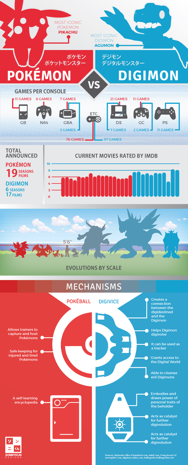
During a great portion of this project, I struggled on how to get the infographic to be a comparison without it being split down the middle the whole entire page. My original concept and rough digital version looked like this: 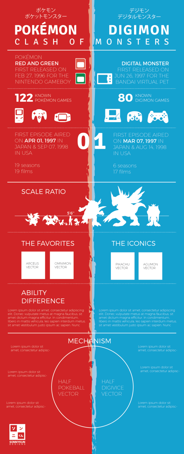
It wasn’t until one of my classmates showed me of an example of another comparison infographic that I got a new perspective, so I continued to do some visual research until I came up with my current design. I really wanted to break it down visually and with different contrast, because in my opinion, I get really tired of looking a big block of the same color easily and so I mixed gaps of soft, calming, neutral gray in between colors.
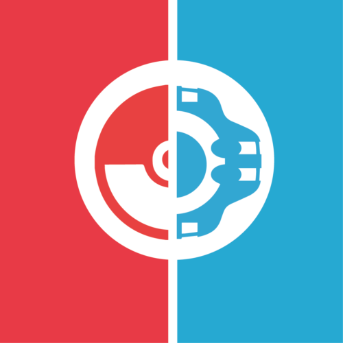
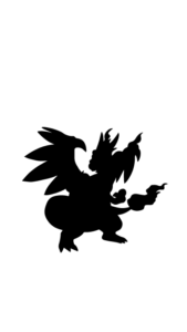
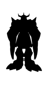
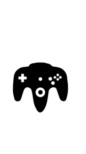
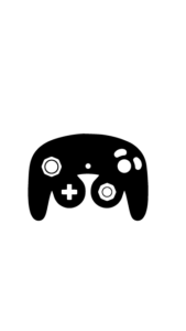
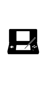
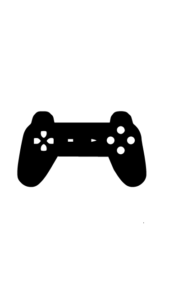
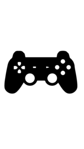
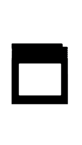
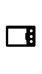
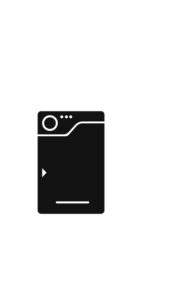
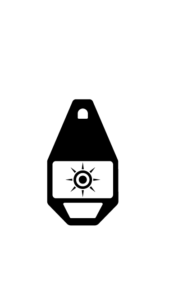
Graphics:
These are the vectors I created using the pen tool and shapes tool within Illustrator.


Sources & Borrowed Images:
Finding actual statistics for these subjects was actually really hard. I guess most people wouldn’t take them seriously enough, so I mostly used their Wikipedia pages and other’s research.
http://bulbapedia.bulbagarden.net/
http://firedragon1321.tumblr.com/


Style Guide:
Typefaces: Montserrat, Signika
Colors: #E52E37, #0DA2CE, #E6E7E8, #58595B
Conclusion:
In conclusion, I felt really accomplish in making something that I could appreciate as well as something I am willing to share with my friends and any fans out there.
[/et_pb_text][/et_pb_column][/et_pb_row][et_pb_row admin_label=”Row”][et_pb_column type=”2_3″][/et_pb_column][et_pb_column type=”1_3″][/et_pb_column][/et_pb_row][/et_pb_section]