[et_pb_section admin_label=”section”][et_pb_row admin_label=”row”][et_pb_column type=”4_4″][et_pb_post_title admin_label=”Post Title” title=”on” meta=”off” author=”on” date=”on” categories=”on” comments=”on” featured_image=”off” featured_placement=”below” parallax_effect=”on” parallax_method=”on” text_orientation=”left” text_color=”dark” text_background=”off” text_bg_color=”rgba(255,255,255,0.9)” module_bg_color=”rgba(255,255,255,0)” title_all_caps=”off” use_border_color=”off” border_color=”#ffffff” border_style=”solid”] [/et_pb_post_title][et_pb_text admin_label=”Text” background_layout=”light” text_orientation=”left” use_border_color=”off” border_color=”#ffffff” border_style=”solid”]
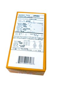
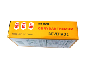
Instant Chrysanthemum Beverage is something that I found nostalgic, a blast from the past, something I found I was truly attached. It was something I would drink every day. Instant Chrysanthemum Beverage is one of the oldest, classic, and popular Asian drinks out there. First drunken during the Song Dynasty (960-1279). It could be found in any Asian or Oriental supermarket.
Target Audience
The target audience would be for the younger group of people that go to Asian markets.
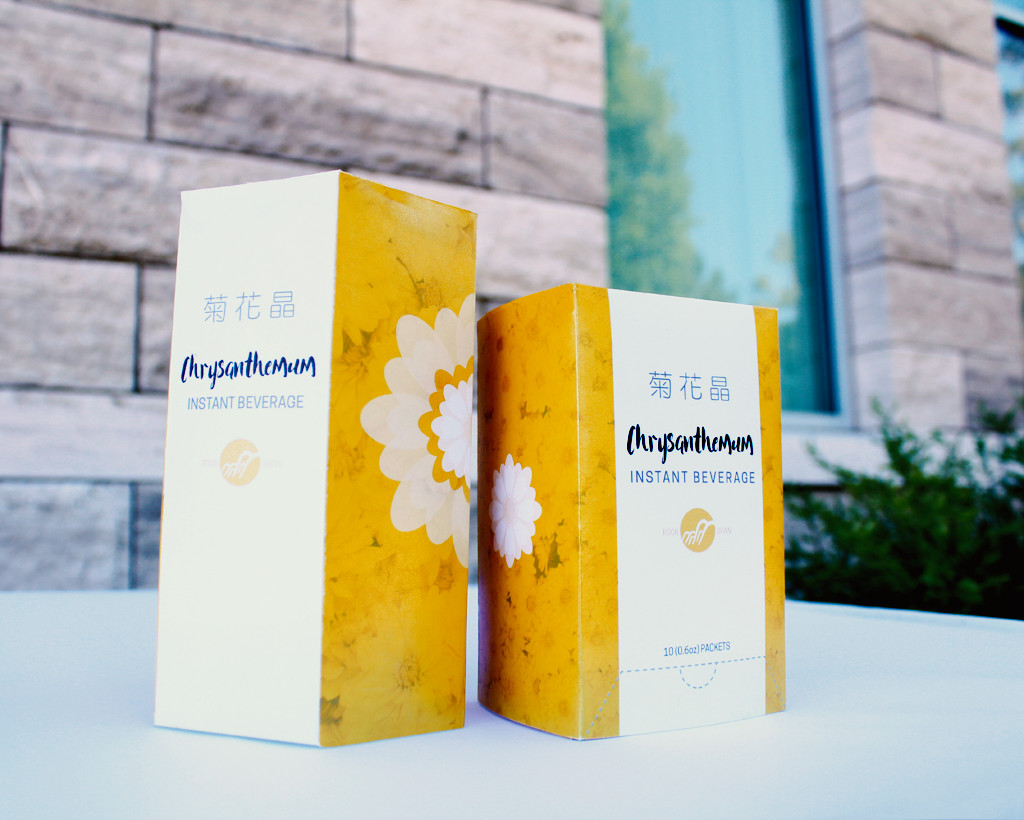
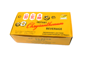
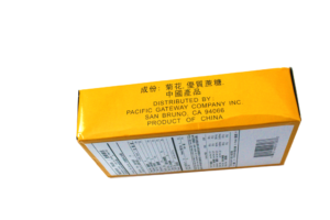
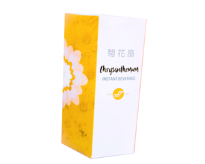
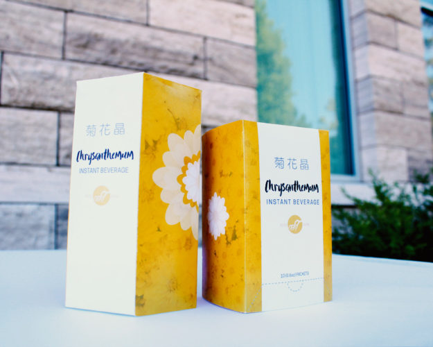
It has been the same design for decades. The new design fit with the style of other modern-day teas, which are very clean, minimalistic, eye-catching, and not something we would see in a historical museum.
Sales
I know improving this product’s design will bring in more youth and tea lovers all around making more opportunity for sales. Its new design could even bring it into other stores and markets as well.
Color Scheme
For the color scheme, I tried to keep the yellow color from the original package so it can give off a similar feel or memory. I removed the red color, because with the yellow, it looks too oriental or like McDonalds.
Redesigned Logo


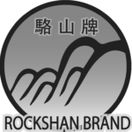

For a modern package design, one needs a modern logo. I wanted to have the same minimalistic feel as the package. I kept the old, silhouette of the mountains or branch-looking thing, and smoothed out the gradient. I removed the Chinese symbol to make it to appealing for a bigger audience. I also removed the outline of the brand title, because big outlines on text is a bad design cue.
Recommended logo size is about 1/2 inch
Process
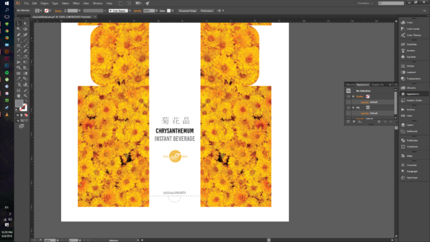
Original look / progress: My original had a cleaner type, but I did not like it because it was kind of boring. I actually just hate the word Chrysanthemum and its fitting in content. The flowers on sides were originally too bright and high contrast. My friend also said that the type I used was too traditional looking.
Building it was much more difficult than designing it. Getting the folds to evenly fit to the edge was a struggle and make the side flap long enough to fit into the box was pretty hard,
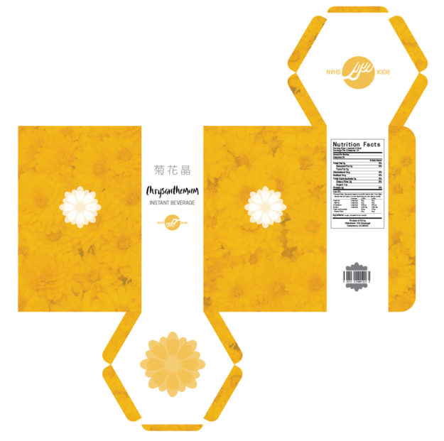
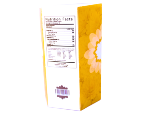
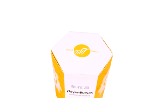
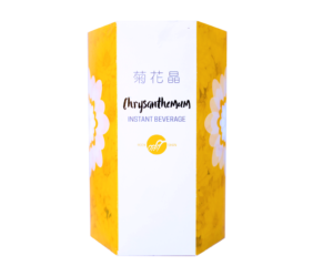
Meeting with classmates, I saw a package that was hexagonal and originally I wanted to do one, but it seem complex to design the folds and structure until a classmate showed me where she got her packaging template and so I attempted. Moving the same on another surface felt weird because now I had so much more empty space. I had to tweak enough to make fill more space used-well.
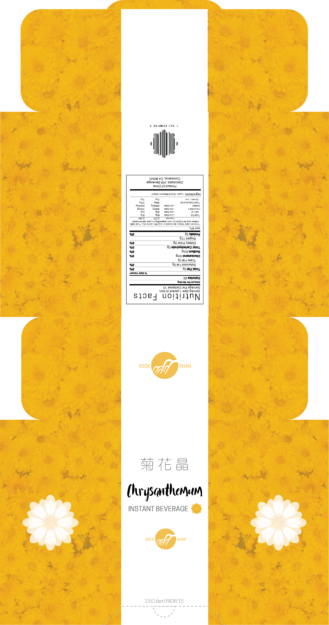
Flat Package Design:
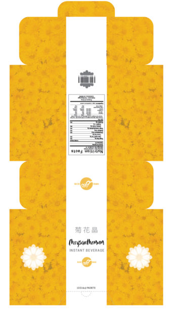
I added overlay over the flowers, repeated the brand/logo, created a nutrition label, and added a barcode. Also, I switched to a more modern (not modern in typography sense, but modern-trending style) font as the title.
Version 1:
Version 2 & 3: The Finals
The Comparison: Old v. New
Pitch Book
Conclusion
Overall, I think the new design fits a bigger range of audiences both young and not too old though sorry, but at least it does not just target the old. The one Chinese phrase is probably good enough to let them know what it is. The ingredients haven’t changed in decades so I assume they would care or think too much of it. The ingredient in this thing is just sugar and chrysanthemum extract so not much reason to inform in Chinese. I like the clean look and I feel I would differ to other on the shelves. I think of two I think many like the hexagon shape one because it is very different. Browsing through shelves and shelves or square boxes it will definitely be a key hitter and very noticeable, great for sales. Also, i made the hexagon one bigger to give the false hope of it having more content in it, just like what they do to chip bags, so it kind is a sales gimmick.
[/et_pb_text][/et_pb_column][/et_pb_row][et_pb_row admin_label=”Row”][et_pb_column type=”2_3″][/et_pb_column][et_pb_column type=”1_3″][/et_pb_column][/et_pb_row][et_pb_row admin_label=”Row”][et_pb_column type=”4_4″][/et_pb_column][/et_pb_row][/et_pb_section]
